


You know what today is? Sure you do, you can feel it in the air! It’s Car Brochure Art Appreciation Day! This is a magical holiday that occurs whenever a particular bit of auto brochure art catches my eyebones and then I can’t stop thinking about it, so I talk about it here, spreading its influence far and wide, like sneezing into a fan. Today I want to look at a particular sort of style seen on not just car brochures, but in a lot of commercial art, especially paperback book covers and record albums. I’ve been calling this style Coarse-and-Smooth in my head, and I think you’ll see why.
Like so much of the art seen on these brochures from the 1950s to the 1970s, this is an illustrative style as opposed to a photographic one. There’s some incredible talent and skill displayed here, and I really appreciate how this particular style combines a loose, very hand-of-the-artist sort of technique along with some genuinely hyperreal rendering.

![]()
In the case of this 1964 Mercury brochure, that divide in style is constrained by the subject of the work: the backgrounds and people are rendered in the coarse, expressive style, while the cars are rendered with incredible accuracy and care. Here, look:
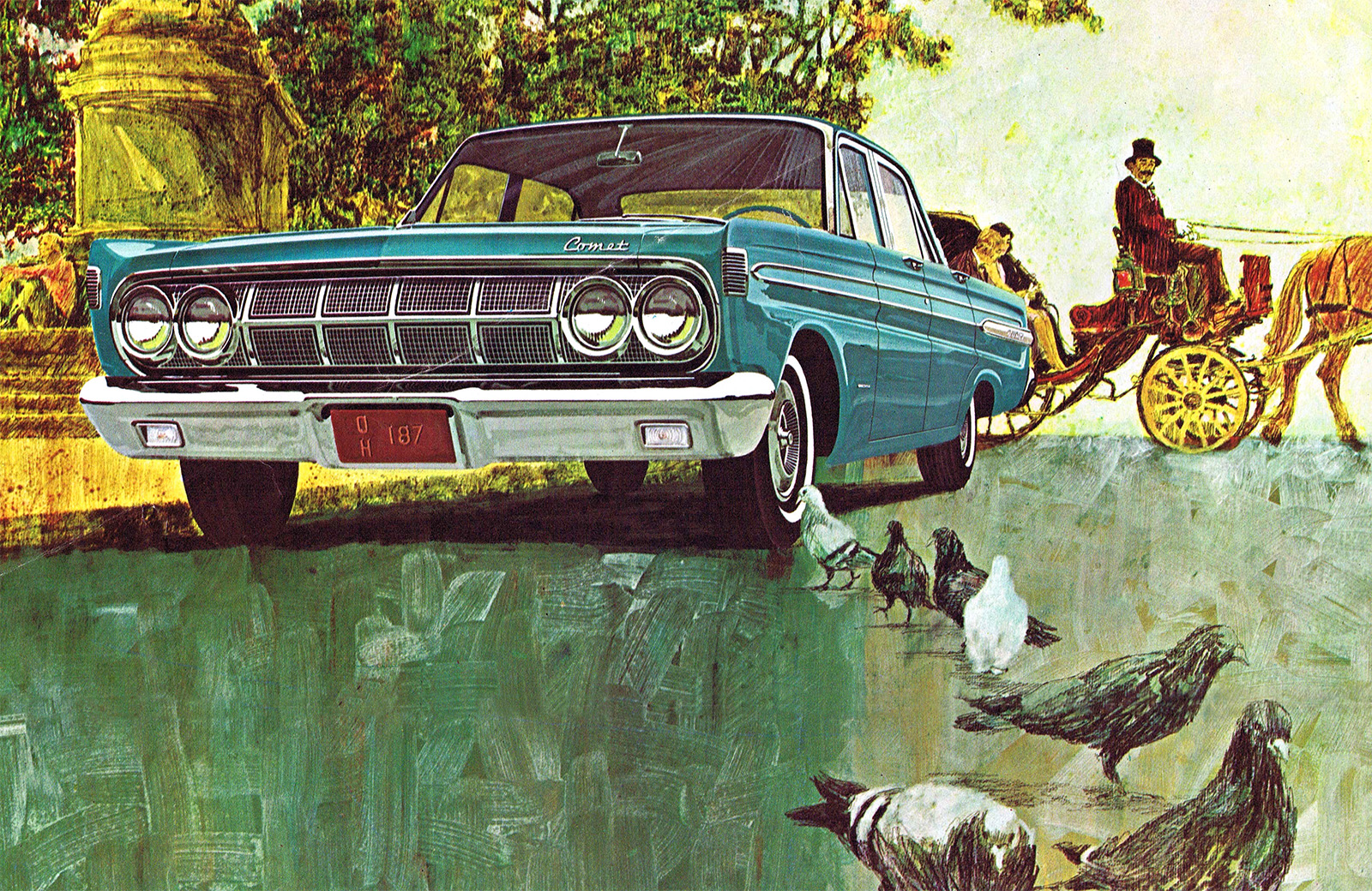

Look at how that Comet is rendered compared to the road surface, that small congregation of pigeons, the background flora, and the carriage in the background, complete with a horse’s ass. The style of the coarse parts I think is really lovely, and looks a bit like a gouache painting, which it may very well have been. Maybe tempera?
The car is impeccably illustrated, with every glint of chrome and shadow captured, the gloss of the paint beautifully reproduced, and there it sits, plopped onto that loose backdrop.
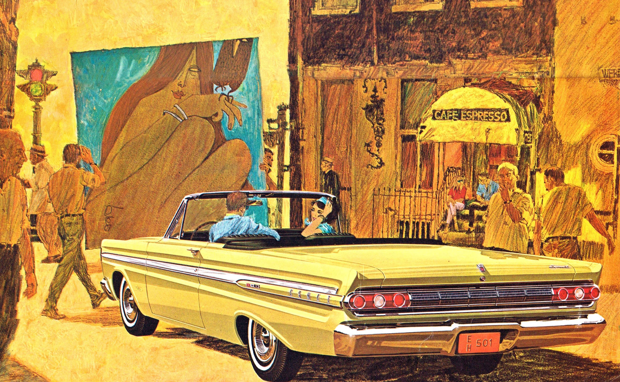

I really love this one: the golden mustardy color scheme of everything, that amazing poster of what seems to be a woman and her crow, and especially how the people in the car are part of the coarse style while the car is, as expected, tightly rendered and perfect. The technique draws the focus to the car in a subtle and exciting way, and when you look at the image above, where the color of the car feels like it should get lost in that jaundiced sea, it doesn’t, and that’s a hell of an achievement.
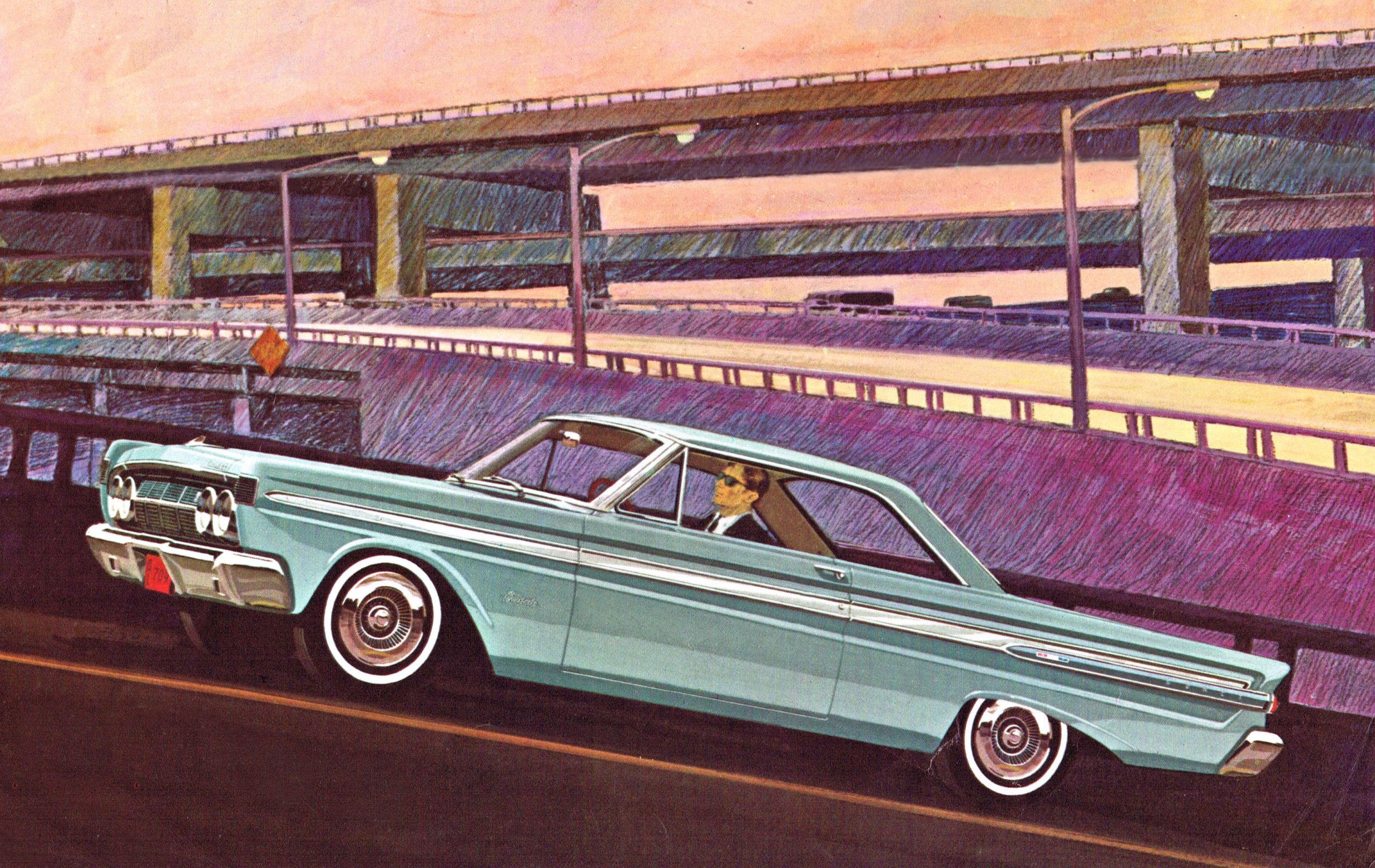

Here’s another great example: Agent Uphill there is barreling up that on-ramp, and the complex array of overpasses and whatever is handled in what looks to be colored pencils. Again, the car pops, but still manages to feel part of the whole composition.
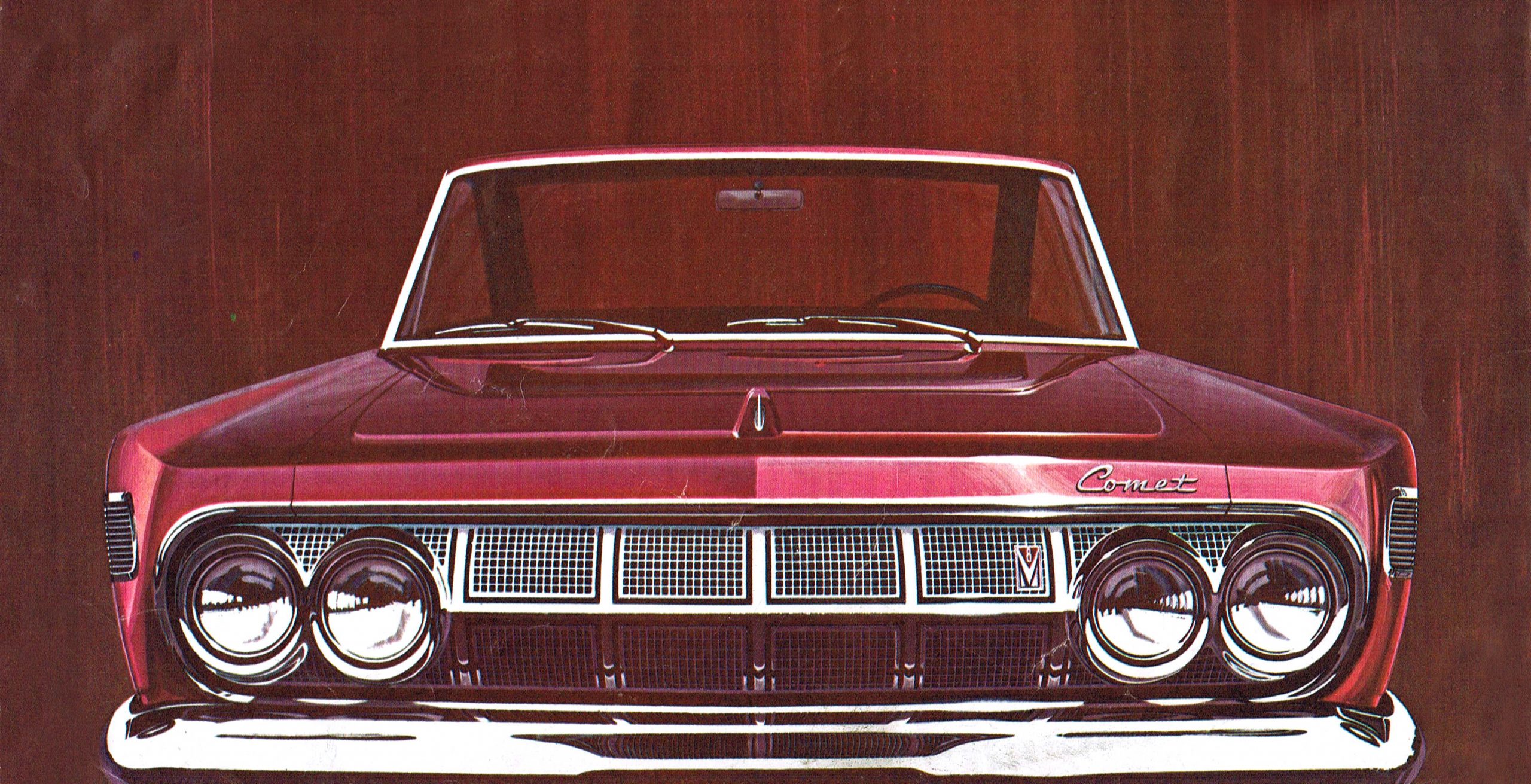

In some of the illustrations, all that’s needed is a brushy, featureless background; in this example above, the brushiness almost feels like woodgrain. Look how beautifully the artist captures the glint of light just to the left of the Comet badge. Holy crap that’s good. The paint feels slightly metallic here! Ugh, so good.
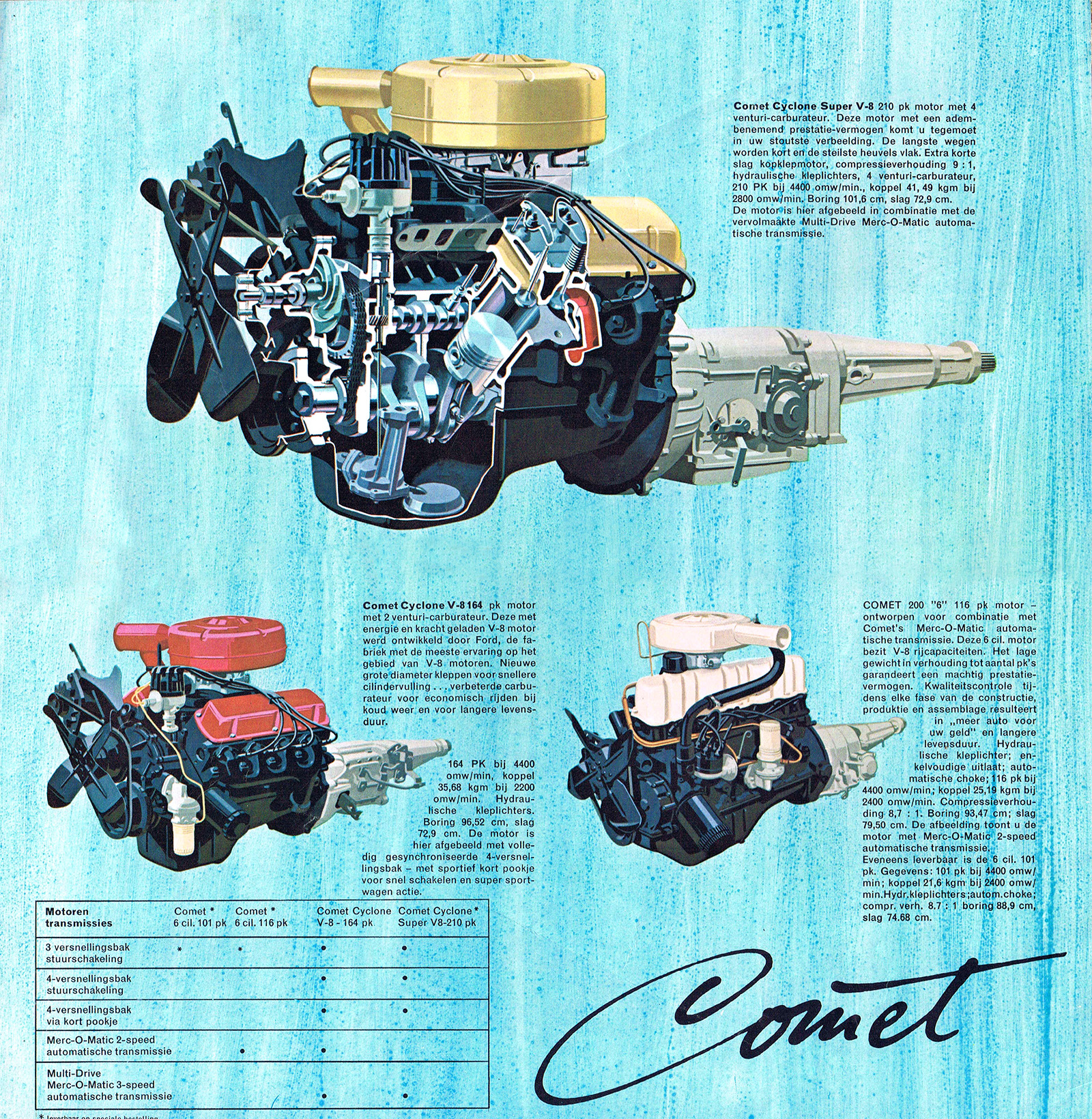

Here, the engines get the hyperreal treatment as they float over a watery-seeming blue wash, with a beautiful cutaway V8 up top. And I love seeing the Comet badge script rendered in ink!
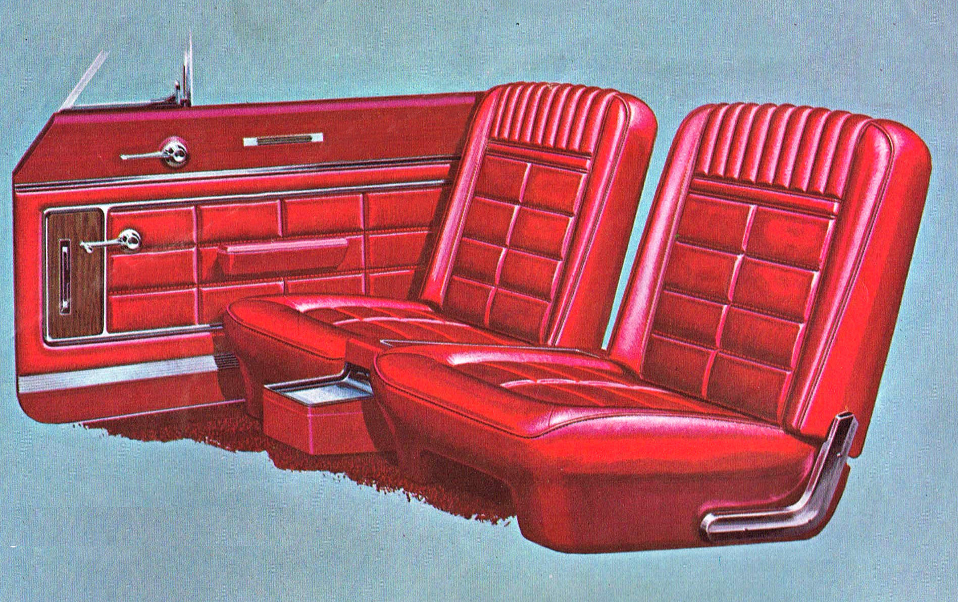

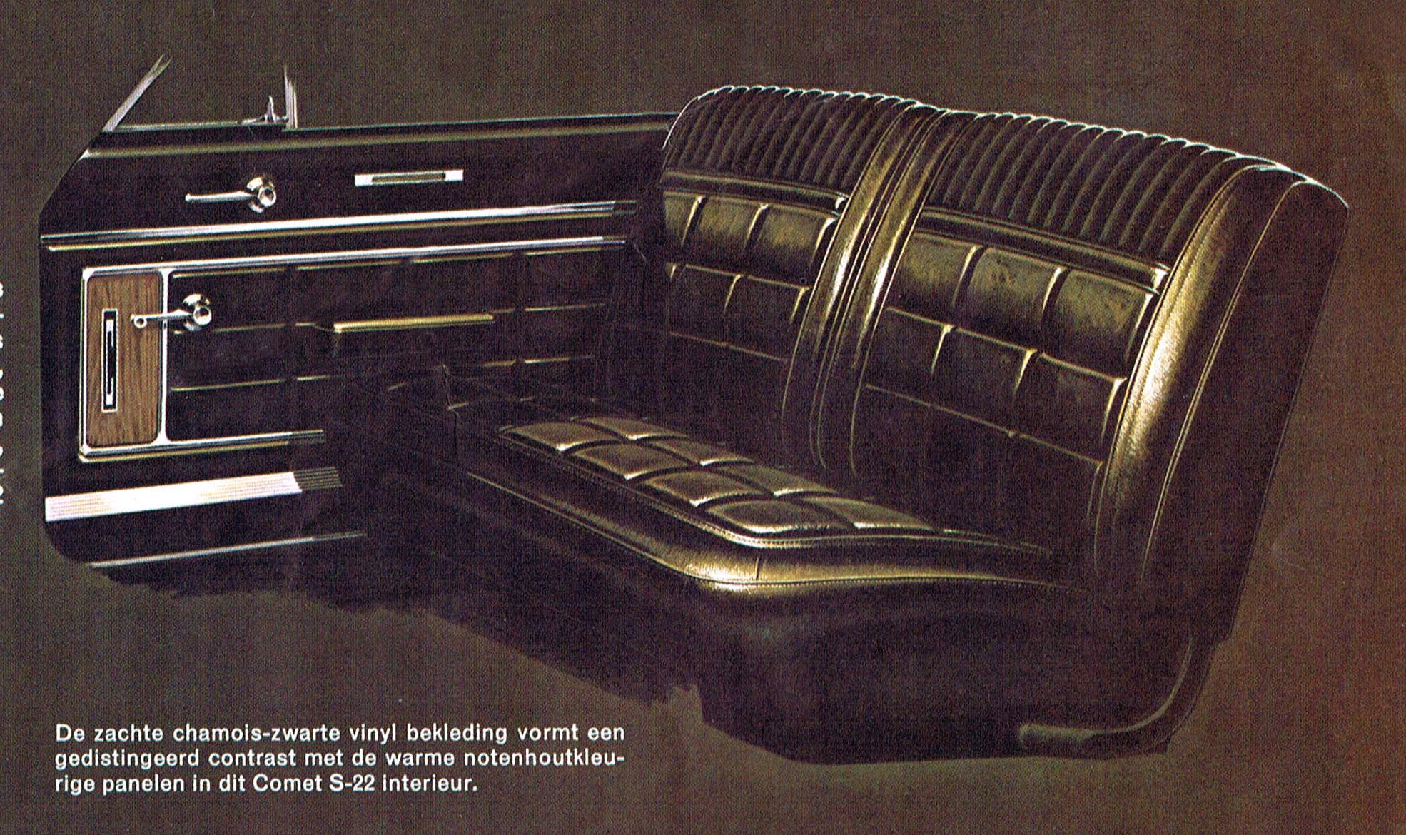

The only place we don’t really see the two-style approach here is in these interior renders, which are careful and extremely precise, but just slightly looser than the exterior car drawings. Look at the edges to see it clearly. These are just wonderful illustrations in their own right.
These artist were so damn good at what they did! Revel in these, friends! Give those eyes something to really enjoy!
link