


First impressions stick. In anime that means eyes, lines, texture, the whole screen handshake. When proportions snap logic in half or CGI flattens weight, viewers feel it faster than plot twists. Ugly angles pull you out, weird shading keeps you out, and good writing struggles to coax you back.
Critiques pile up where models drift off-model, where fights look cheaper than keychain toys, where one bad frame spawns a thousand memes. Yet some shows wear their visual sins on every cel. None is unwatchable for everyone, yet some found a way to turn art itself into a hurdle taller than any story beat.

Related
Doesn’t mean they’re bad or unwatchable, some are even intended, and they work. Still, there’s no denying that the anime in this list has some of the worst art work.
10
Ping Pong the Animation (2014)
Scribble Lines That Never Sit Still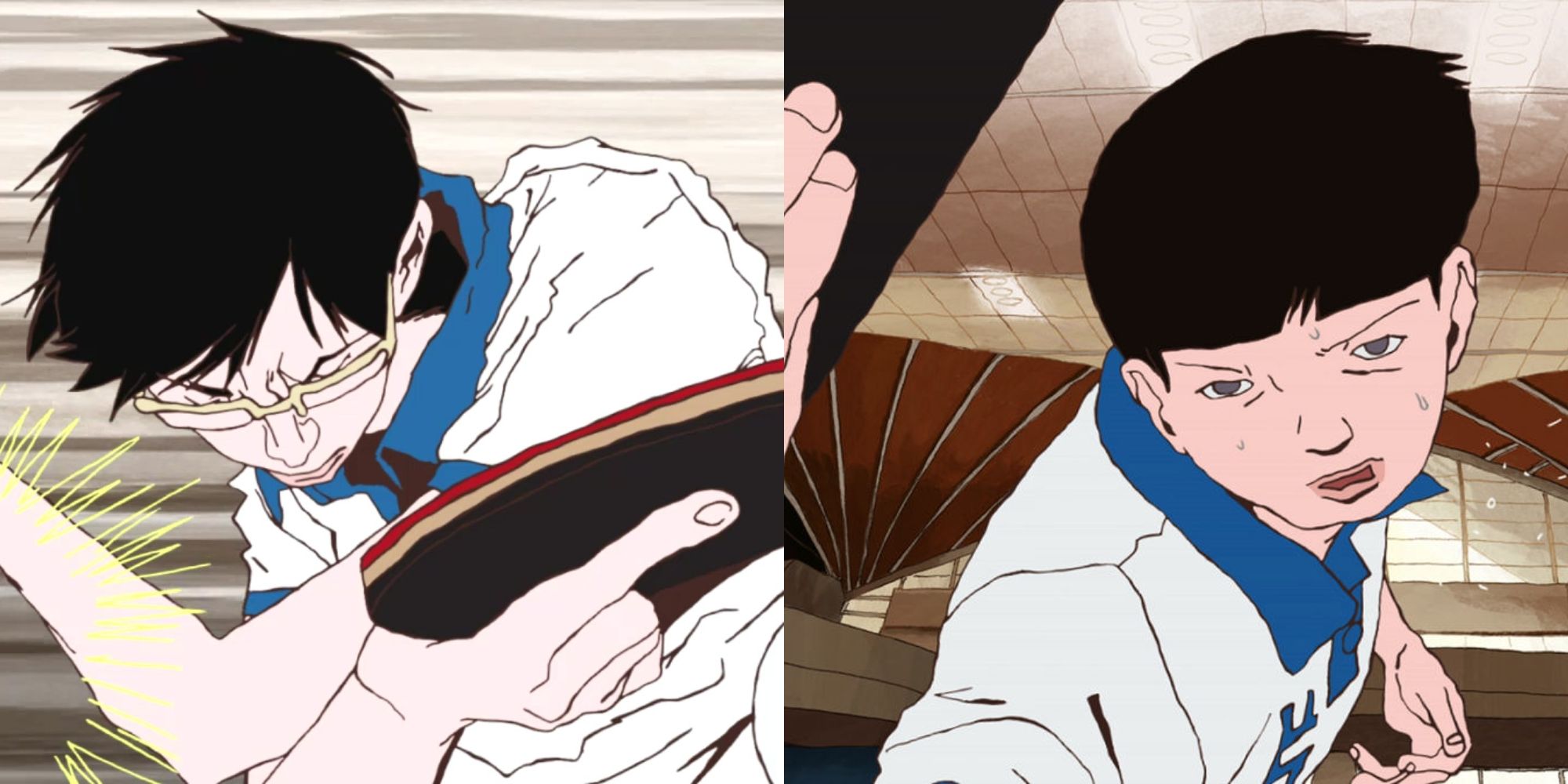
Yuasa’s restless strokes trade polish for motion, but newcomers see only wobbling outlines and faces melting under marker jitter. Paddle details vanish mid-rally; limbs telescope between cuts like rubber in a desk fan.
Color blocks flood backgrounds, leaving figures in negative space. Characters shift models three times in one sentence, and chalk-smear shading makes sweat look like crayon. Style screams kinetic; some ears hear static.
Once rhythm clicks, storytelling soars, yet many tap out first set, convinced the show escaped from an art-school flipbook. Ping Pong proves experimental flair can look unfinished to untrained eyes.
9
One Piece (1999 – Pre-Marineford)
Cartoon Chaos in Overdrive
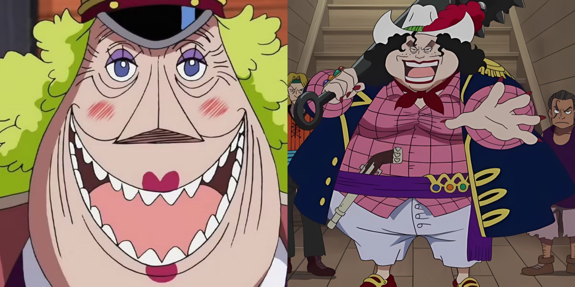
Eiichiro Oda’s world bursts with life, also with chinless giants and anatomy that ignores skeletal rights. Straw Hat bodies bend like licorice, while post-timeskip curves go straight to caricature.
Color work relies on flat fills, shadows drop out, and crowd shots smear into off-model blobs. The charm feels deliberate, yet many can’t watch without squinting at lopsided grins and rubber-hose limbs.
A thousand-episode marathon magnifies every quirk. If goofy designs hook you, paradise; if not, the art alone can sink years of adventure before the Grand Line even shows.
8
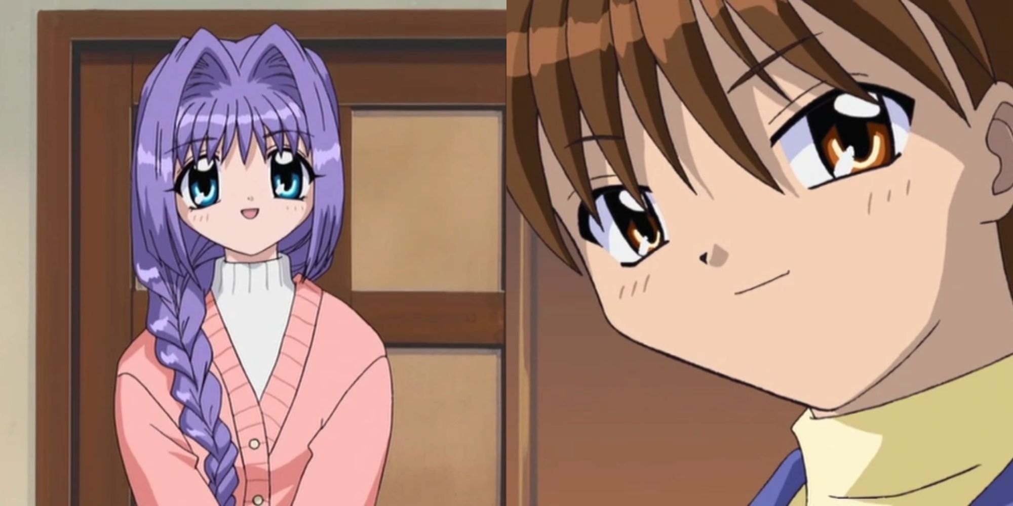
Code Geass (2006 – 2008)
Noodles in Knight Armor
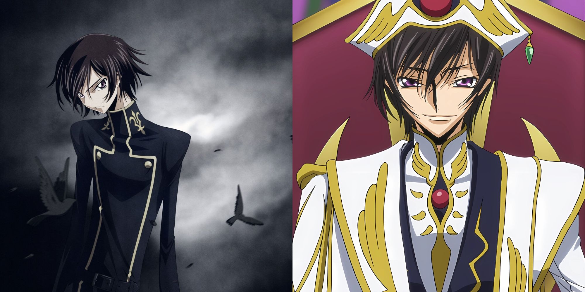
CLAMP’s signature look stretches characters to mannequin height; arms run too long, torsos too thin. Pointed chins feel sharp enough to pop Lelouch’s helmet and jackets flap on impossibly narrow shoulders.
Mecha battles dazzle, yet cockpit close-ups reveal elbows that miss their joints. Formal wear drapes like curtains over lamp posts, making drama scenes feel accidentally comedic.
Story twists earn praise, but every still frame reminds audiences they entered a fashion show for praying mantises. Elegance was the goal, exaggerated marionettes became the legacy.
7
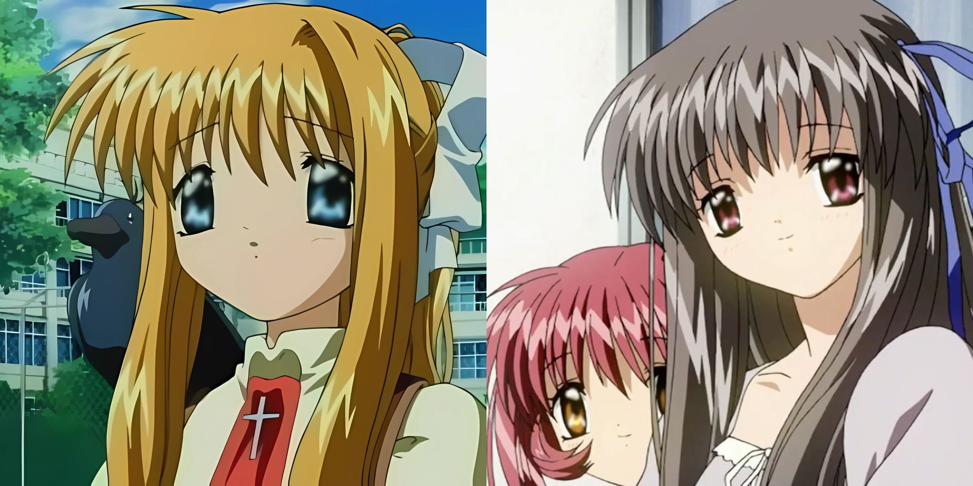
Clannad (2007 – 2008)
Eyes Too Wide for the Screen
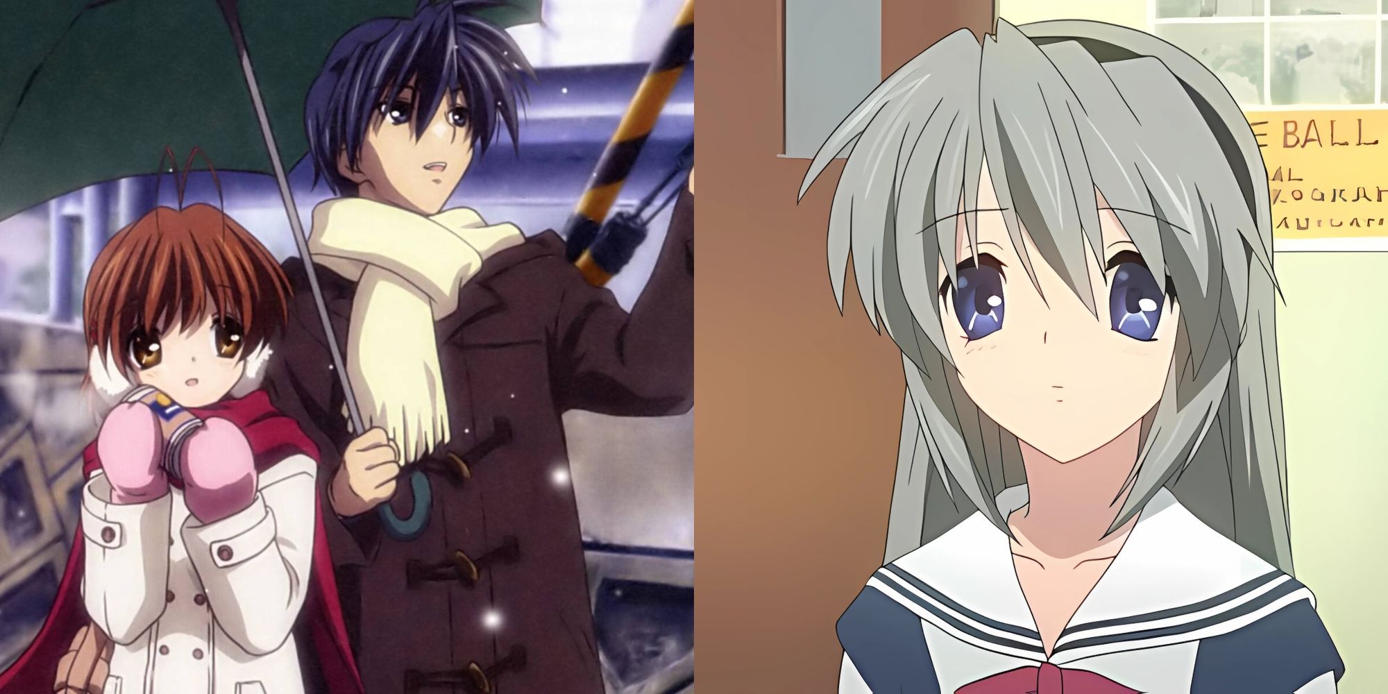
Kyoto Animation maxed out “moe,” landing on pupils big enough to host star systems. Foreheads shrink, noses drop, mouths hug the chin like stickers, and new viewers backpedal before the tear-jerker even starts.
Soft watercolor palettes try soothing the shock, yet uncanny first contact never fades. Tomoya and Nagisa craft heart-ache, but saucer eyes keep flashing hazard beacons between sobs.
Defenders cite era charm; skeptics call it a gateway uncanny valley. Clannad proves saccharine shapes can taste sour when pushed past comfort curves.
6
The Seven Deadly Sins Seasons 3-4 (2019 – 2021)
When PowerPoints Replace Punches
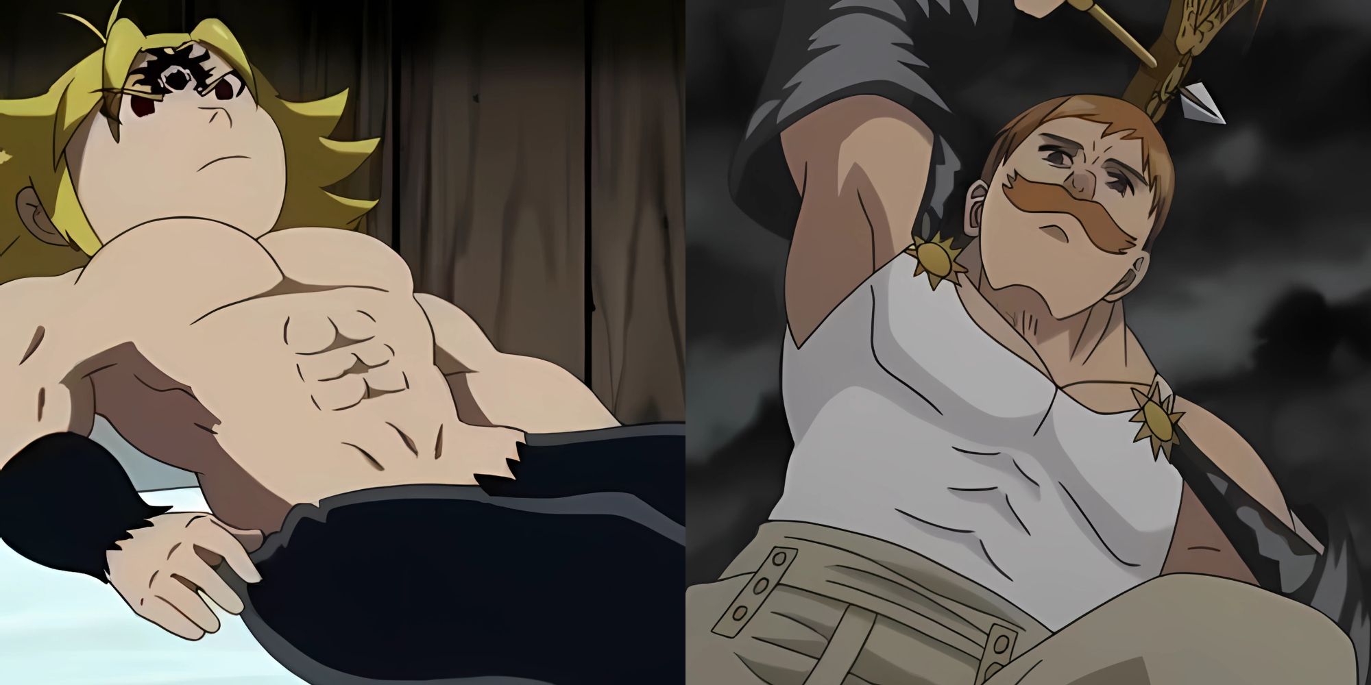
Studio Deen took over, quality took a nosedive. Epic brawls freeze on smear frames, swords hang mid-air while dialogue continues. Meliodas versus Escanor, once manga glory, dissolves into wobbling outlines topped with JPEG fire.
Shading evaporates, blood runs the same tone as skin, and crowd scenes replicate soldiers like copy-paste stamps. Character proportions vary shot to shot, breaking immersion faster than any demon roar.
Earlier seasons looked crisp; the downgrade stung louder than narrative stakes. Fans coined whole threads ranking which episode hurt worst, a chart no show wants drawn.
5
Aku no Hana (2013)
Rotoscope of Unease
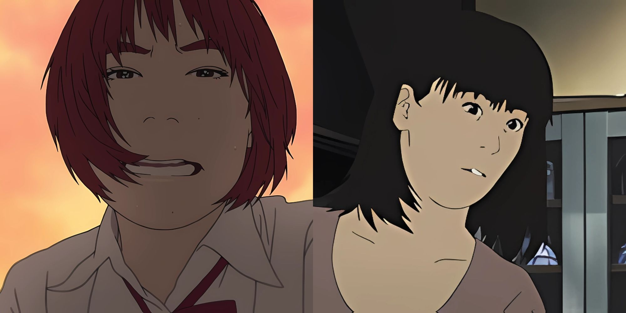
Live footage traced into line art sounded avant-garde, landed in the uncanny valley. Skin tones float, eyes misfire focus, hallways quiver with lens warps that clash against anime expectations.
The grim story might fit raw realism, yet the mix feels half dream, half headache. Every step squeaks like motion capture stuck in mud, pulling tension from horror into plain discomfort.
Some applaud bravery, most drop out after one episode, claiming nausea. Artistic risk deserves credit, but the outcome still tops lists of “styles that chased real and caught wrong.”
4
Gakuen Handsome (2016)
Chins That Could Cut Steel
Parody or pen-manship crime? Faces angle into ten-inch spears, noses drift off center, and ears glue to eyebrows without apology. Frames swap models, hair spikes poke off canvas, and shading forgets which direction light travels.
Backgrounds reuse default gradient fills, limbs pop out of sleeves at alien bends, and kiss scenes align mouths like broken USB ports. The show laughs at itself; many viewers join in, stunned silent.
Elastic design can charm, but Gakuen Handsome’s geometry warps so far it circles past satire into optical assault territory.
3
Kanon (2002)
Early-2000s Moe Mutations
Proto-Key aesthetics stretch eyes wider than tea saucers, suspend noses as vague dots, and drop mouths to the chin line. Snowy palettes wash detail away, leaving blank pastel faces that blur in motion.
Budget cuts ghost through night scenes; outlines fade, frames repeat, and background characters morph species between cuts. Piano queues swell; viewers stare at floating orbs disguised as heads.
Later remakes fixed much, yet the first adaptation stays archived as a lesson: push cuteness too far and charm loops back to eerie.
2
Air (TV) (2005)
Sun-Bleached Pastel and Anatomy Drift
Visual novel roots show in oversize eyes, tiny mouths, and shoulders that tilt like coat hangers. Summer glare bleaches colors; characters glow radioactive peach against cloudless skies.
Zooms smear line art, hair gradients band, and limbs flex beyond joint limits when drama spikes. Emotional payoff lands, but screenshots read like alien doll prototypes.
Related
10 Strongest Eye Abilities In Anime, Ranked
We’ve seen several powerful eye abilities across different anime series, but these are surely the strongest ones.
Air’s softness wins nostalgia votes; outsiders log off after three episodes, claiming the designs look melted by the series’ own sunshine.
1
Crayon Shin-Chan (1992 – present)
Kindergarten Crayons on Prime Time
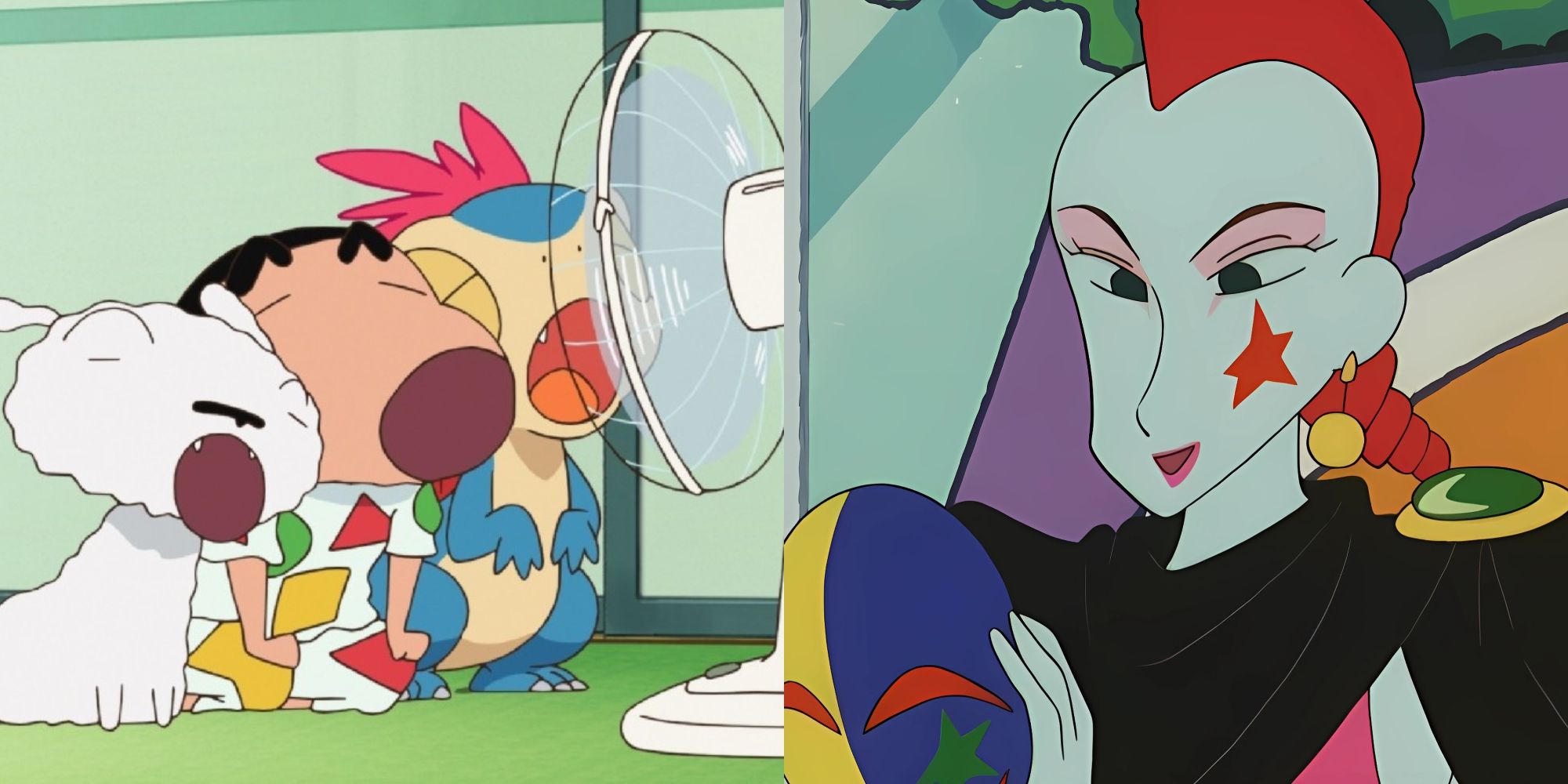
Intentionally childlike, yet the scribble style still repels fresh eyes. Heads blocky, eyes dots, lines rattle as if drawn left-handed on a bus. Coloring bleeds past outlines, and scale snaps, Shin-Chan’s dog grows three sizes by the next gag.
The aesthetic amplifies humor; it also alienates audiences expecting typical anime polish. Rapid-fire slapstick plus shaky draftsmanship equals double culture shock.
Long-time fans defend charm and legacy, but newcomers bail early, convinced the raw art signals raw quality. Shin-Chan thrives anyway; evidence crude can still conquer airtime.
link